Photoshop
Indesign
Typography
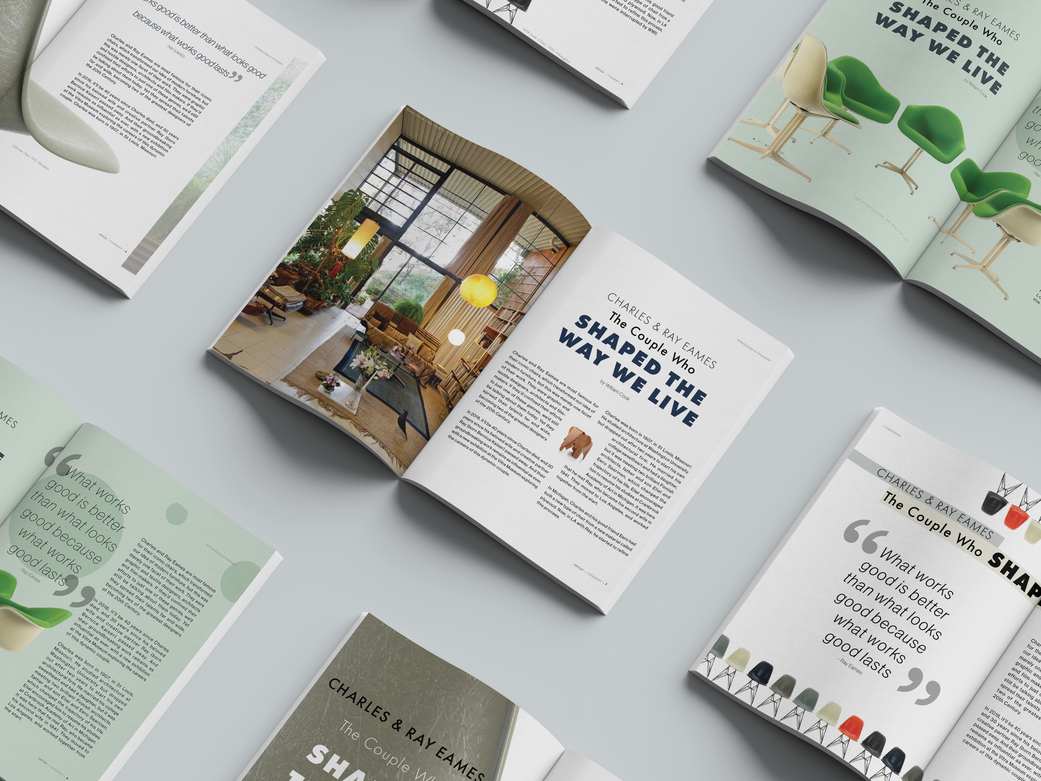
Print & Layout Design
Overview
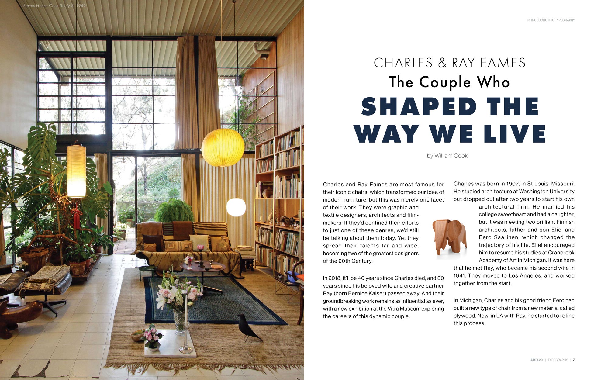
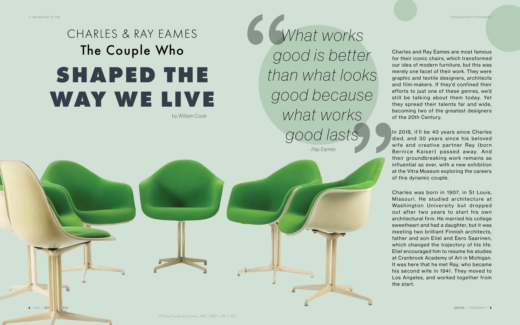
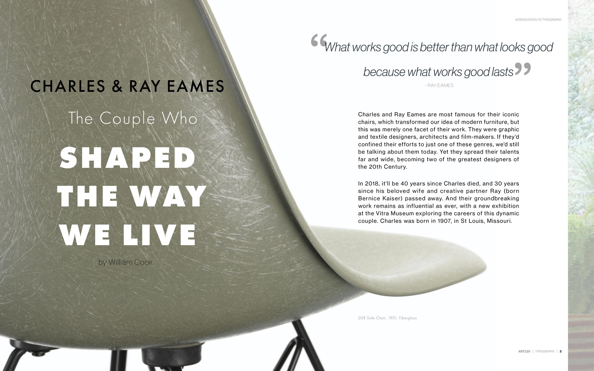
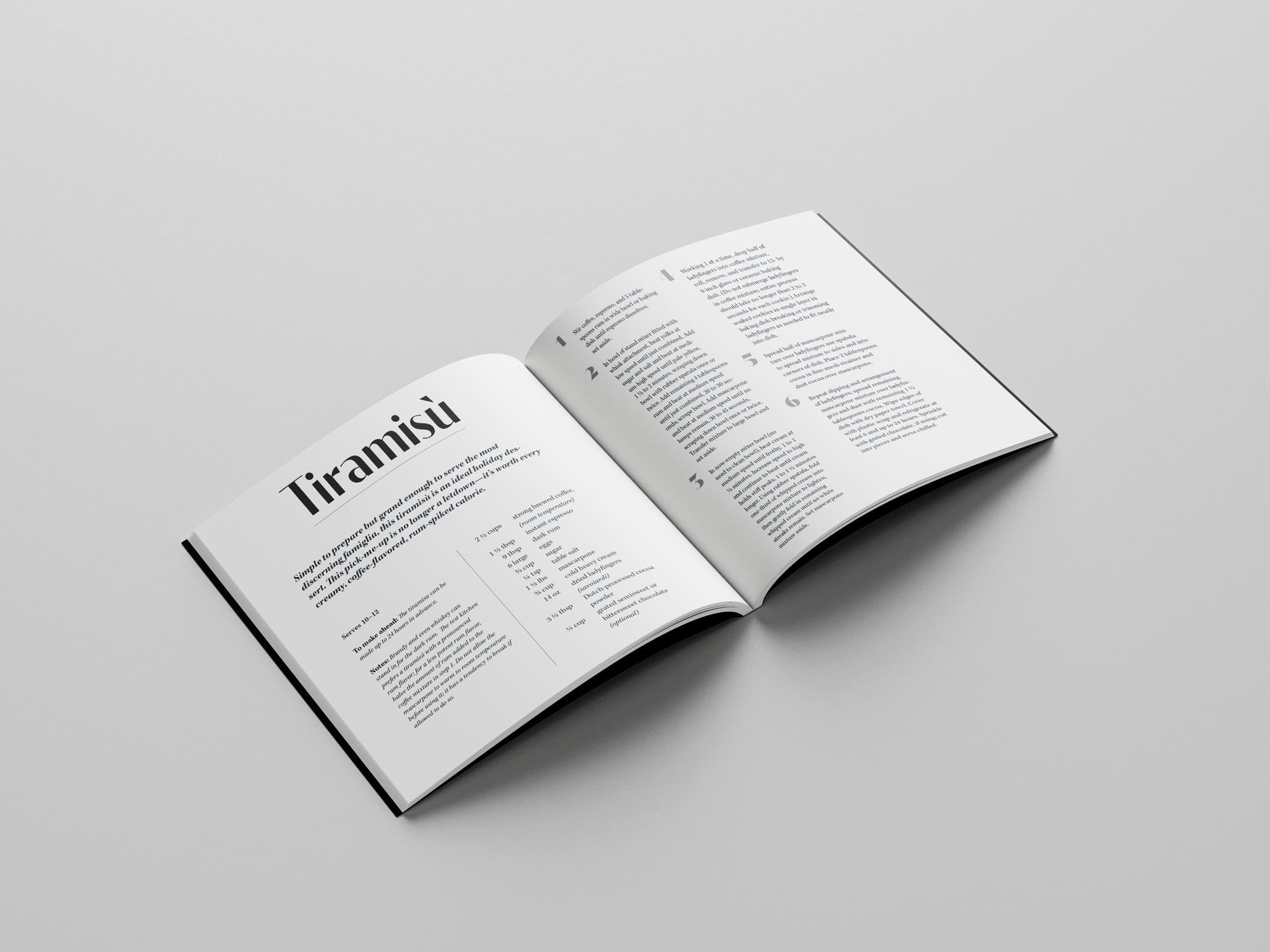
To build a solid foundation in typography, I created a typographic handbook for my class, covering fundamental rules and extending into more creative explorations of compostion and hierarchy.
The Takeaway
I learned that when designing a layout, typography comes first. Whether or not imagery is included, establishing typographic hierarchy, thoughtful type pairing, and effective use of white space are essential for strong composition.
