UX / UI
Figma
Photoshop
- 💻 HTML/CSS/JS

K9 Solutions Website Redesign
The Challenge
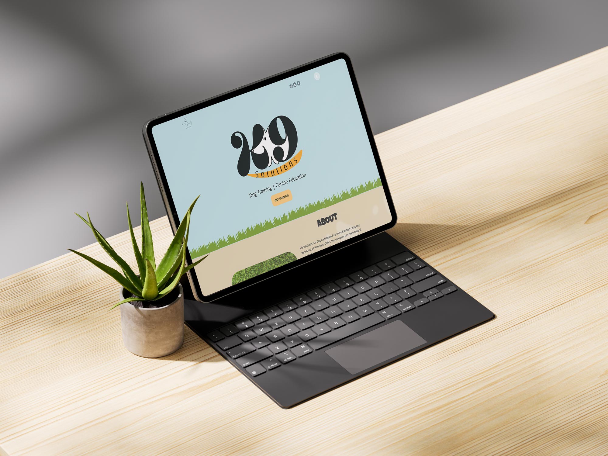
For this website redesign, my goal was to introduce more personality by incorporating warm, friendly colors, engaging copy, and playful custom illustrations. A key focus was to develop a single-page website layout that ensured easy navigation and quick access to essential information for potential clients.
The Solution
I refreshed the brand identity by designing a new logo and incorporating calming, gentle tones, giving the design a more inviting and visualy engaging aesthetic.
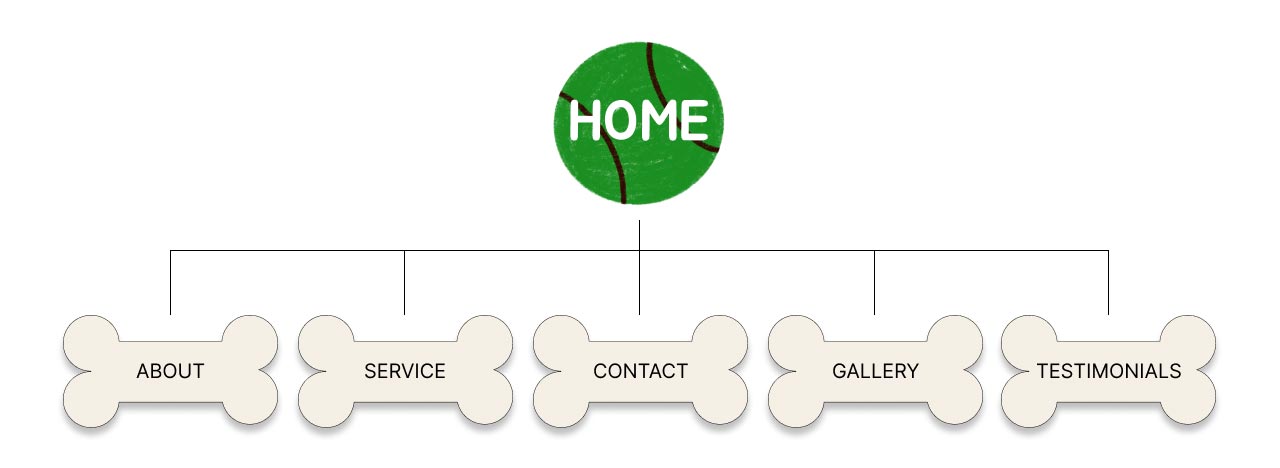
Site Map

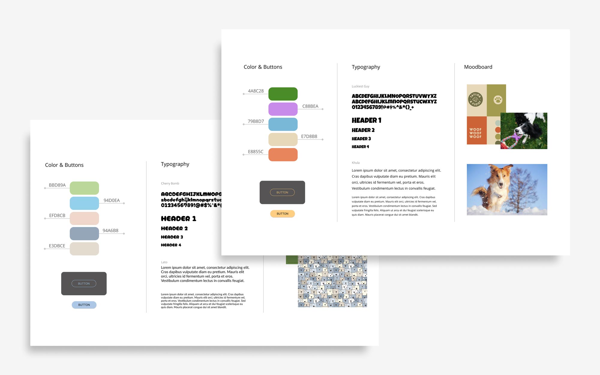
Style Guides
For the typography I chose to go with a bold and friendly display typeface for my headings, and paired that with a clean and minimal sans serif for my subheadings and body copy to increase readability.
For the colors, I wanted to go with a friendly and inviting color pallet, experimenting with soft pastel colors and brighter variations. I ended up selecting muted colors for the background to create contrast, allowing the images and buttons to stand out in order to guide the viewer's attention to key elements of the site.

Wire Frames
Lo-Fi

Hi-Fi

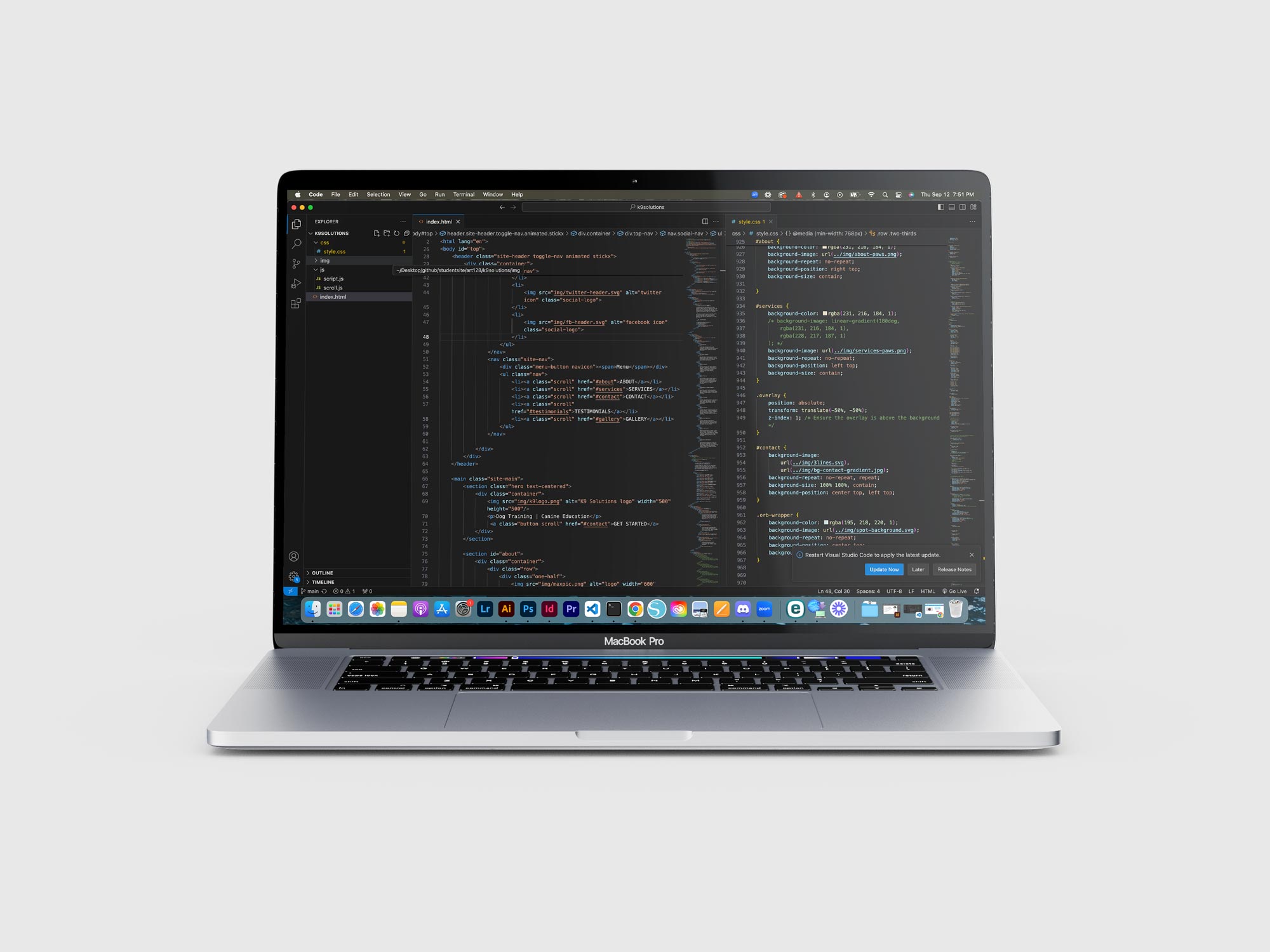
Bespoke Coding Using HTML, CSS, & JS

Interactive UI Design